YouTube Viz A Longitudinal Data Visualization
Milestone 2
Project Goals
The goals of the project are to study the kinds of content and formats that prospered on YouTube through the years and how the creation practices changed. In our opinion, the required steps are:
- Observe the evolution of the popularity of each category
- Compare the distribution of some metrics (views, like, dislikes, duration) over time and category
Additionally, we want to make a fun experience, so that people explore this dataset. Thus, it’d be interesting for someone to be able to see the top videos per category over a given time period, so that he can click on them an enjoy seeing what was popular at that time.
Popularity score
Some different scoring approaches are being considered. Currently, for a category \(C_i\) and a time period \(T\), the score \(score(C_i, T)\) can be defined as \[score(C_i, T) = \sum_{c_j = C_i \wedge t_j \in T} v_j \cdot w_j \] Where for a given video \(j\): \(c_j\) is its category, \(t_j\) its publish date, \(v_j\) its number of views and \(w_j\) the weight associated with the channel that published the video. This weight is inversely proportional to the probability of a channel being sampled during the scrap phase. Rarer channels have higher weights because they are underrepresented in our sample.
To compute the popularity score for a given video, 2 schemes are currently approached:
- Simply take the number of views
- Compute the engagement score: \(\frac{l_j + d_j}{v_j}\). The sum of likes and dislikes over the number of views
Visualizations
Main visualizations

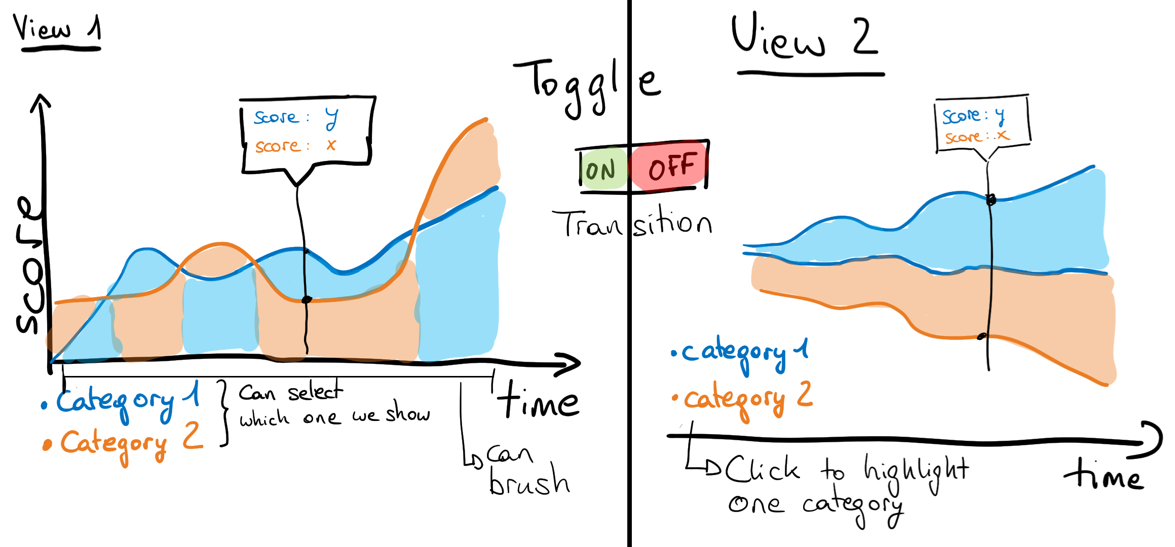
We present in Fig. 1. the core visualizations for our project. The main idea is to be able to toggle between 2 views: a non-stacked and a stacked versions of the score for the categories across time.
- The non-stacked version, on the left, would allow us to compare between the categories. It is a modified version of an area chart in the sense that we only show the lowermost color. So if you take a timestamp, you can know the ranking by looking from top to bottom. You will be able to study a single category by clicking on it
- The stacked version, on the right, would allow us to compare the volume of views over time. It is a stream graph. You can highlight a single category by hovering or clicking on it
This 2 views should be interactive in the sense that when you hover the data, you should be able to see the labels and you should also be able to brush over time to study a timeframe that interests you. An early prototype is available here.
Helper visualizations

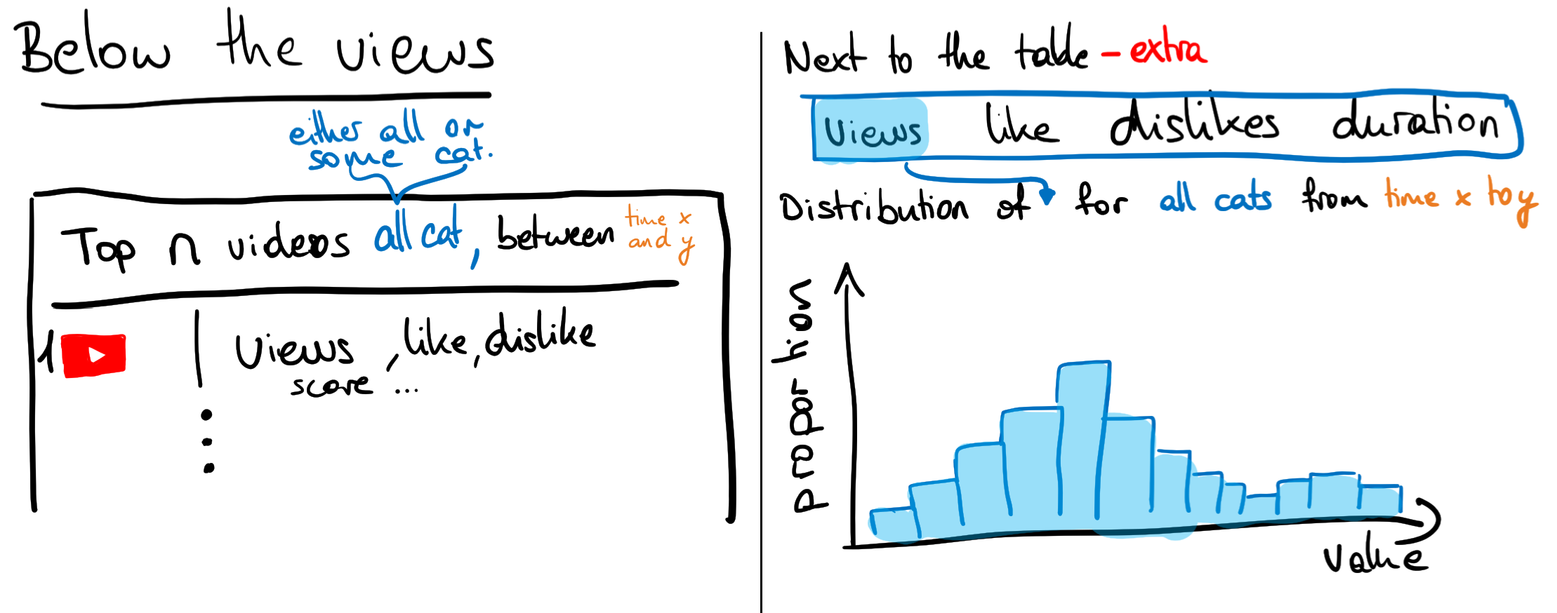
We present in Fig. 2. the visualizations that accompany our core visualizations and are aimed at tackling goal 2. The data populating this visualizations would be dependent on the state – category and timeframe selected – of the core visualizations. These helpers are comprised of two visualizations:
- On the left, a table with the top \(n\) videos
- On the right, a distribution plot for some other metrics (e.g. views, likes, dislikes, duration) that you can toggle between
Tools
The tools and lectures that we plan to use are similar for all visualizations so they are summarized here:
D3.js: For all the visualization partscrossfilter: To handle the large transformed data at different scale (daily, weekly, monthly)- Lectures 5.1/2: On interactivity, for the brush, transitions and crossfilter
- Lecture 6.1: For color picking
- Lecture 11.1: Because we use tabular data
- Lecture 12.1: For story-telling
Extra ideas
- Use smooth transitions between the different views
- Add analysis (labels in the plots) on some events that we deem interesting
- Add embedded video player, so the user never leaves our page 😈